Tuesday, November 3, 2009

Drawing Class Report
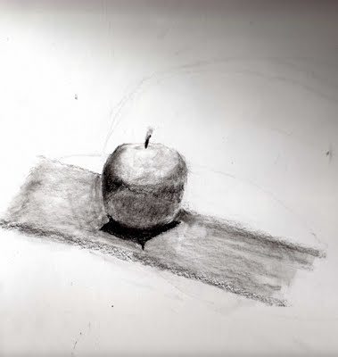
I've been taking a class on basic drawing from Craig Birch at The Scottsdale Artist's School for the past month. The teacher is really good and he happens to be focusing on what I really need to practise. Yes, I went to art school before reality cracked me upside of the head and I got a business degree. Yes, I knew this stuff was important. But somehow, I never managed to pull myself together long enough to do what I needed to do to improve my paintings. No wonder I'm rarely inspired to paint!

Good choices in relative values lie at the heart of every successful painting. There is even a technique wherein the painter first makes a drawing, paints it in grey-scale values only and then when that is right, applies the colors.
I did this apple in the first class. I thought it sucked but others liked it. It does pretty much look like an apple. By the way, these scans suck because my scanner only goes up to 8.75 x 14 inches and my paper is 14 x 17 inches. Here's the homework I did that week. Weak is the word!
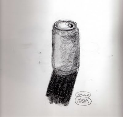
So the next week, we had a vase and a ceramic bottle to draw. I did better on those. I was getting into it. When I figure out which drawing pad that one is in, I'll scan it. It's large so it might not fit on the scanner bed. I had bought a different paper from the one specified in the supply list and went out and got the proper one at another art supply store. (Yes, it killed me to go to a bigger, better store and buy art supplies. I'm surprised that my debit card survived!)

So, being inspired by the ceramics we had drawn in class, I found my favorite teapot at home and drew this.
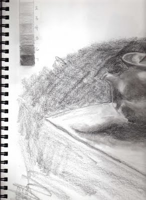
You may have noticed that this is only the left half of the teapot and that it appears that I drew right up to the edge of the paper. I didn't. It's a pity because I think it's my best drawing so far. It was too large for the scanner bed and the two sides didn't scan in with the same values so combining the two in Photoshop Elements was a waste of time. The differences are too distracting to give a good view of it. Maybe later when I set up to photograph these. My favorite camera for doing still lifes and set shots (Sony S-145) is being temperamental, so I don't know when that will happen.

For the next class, Craig set up a still life with a white onion, a green pear, and a red onion. Three values to show together in one drawing.
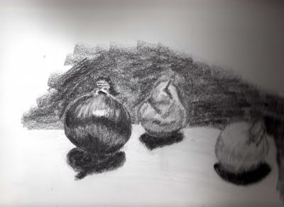
When I stopped to grocery shop on the way home (I like being there after 10 PM when I have the store all to myself!), I was inspired to buy some pomegranates to use for my drawing practise. I set these all up on a tray table about 4 feet away from me with an Ott light focused on them from the side.
The first drawing took a couple of hours and I was fairly pleased with it. For this second one, I just couldn't get into it and spent only about 15 minutes. Still, I like it. It shows most of the important stuff, the mid-tones, shadow, cast shadow, and reflected shadow are all there and fairly accurately.
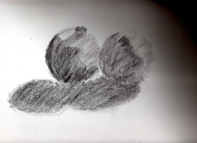
We're using graphite and charcoal pencils (that I've never liked and now loathe!) and playing with values and light and shapes. Now, everything I look at is evaluated in terms of shadow shapes and highlights. I even caught myself doing it at the grocery store after class last night!
I am in LOVE with these Cretacolor Monolith Graphite Sticks! I bought 5 more of the 9B sticks yesterday so I'll always have one. I can't wait to try applying watercolor over a value drawing done with graphite. I bought the set because I love boxes and can rarely resist one. I'm glad I did though because I love the pencil sharpener and eraser that came with it. I've been playing with the varying hardnesses, too. It starts at HB and goes down to 9B. The middle value, 4B, is a different color outside. One of the things I like about the graphite sticks is that you don't have paint from a pencil smearing onto your paper and it lets you have a really long point on your drawing tool.
I've begun to like the process of sorting out and evaluating all the shapes and their relationships spatially as well as their values. In the past, I've been really impatient. I don't paint because I don't want to bother to set up a scene to paint. I don't paint because I don't want to do all the preliminaries such as figuring out the values and other relationships between the shapes that describe the objects. So now maybe my impatience is re-focused.
I just can't wait for Monday nights these days, even if it does include grocery shopping!

Labels: , , , ,

Saturday, May 17, 2008

Casting Call!

Before the month is through, I have to jump in on Michelle Ward's GPP Street Team Crusade No. 20, Casting Call. Nope, she isn't making a movie. Our leader is encouraging us to make paper casts. And you cannot say you don't have what you need to do this one!

Following the lead of another Crusader, Maralena Howard, I tried toilet tissue. Yes, plain old TP, spritzed with water, laid over a deeply etched unmounted rubber stamp. I used a big paint brush with relatively stiff bristles to encourage the paper into the crevices of the stamp, added a couple more layers, encouraging each with the brush, then let it dry. (I let it dry overnight due to other circumstances. It just needs to be dry and a hair dryer or heat gun could be used for this purpose.)

The TP was white Cottonelle. After it dried in the mould, I spritzed it with Merlot Glimmer Mist, dried that with a heat gun, then dry-brushed Gold Fine Golden heavy body acrylic over it. That didn't seem enough so I was going to add black by stamping it with the same stamp, but inked. That didn't really take well - it might have been a little too damp? I realized that I don't have any black acrylic paint! I must but goodness only knows where. So I dug out the China Black Twinkling H2O and used my tiniest brush to add some definition with the black. The stamp is from Ma Vinci's Reliquary.
Since that was pretty cool and I'd just done a tour of all the Crusaders' blogs up through then, I tried someone else's idea too. Clare Brown (by the way, Clare, I love the name of your blog and the Gwen Diehn book, too!) used plain old tissue paper and that seemed like a good idea. I always save the colored tissue paper in which some things are wrapped. This paper is from Joggles and has some sort of sizing on it that makes for a harder, smoother, shinier surface and also keeps the layers of wet tissue from merging. Note to self, add some PPA (my favorite adhesive, Perfect Paper Adhesive) before adding the second and subsequent layers when doing this way again. I totally lost the last layer that just floated away when I picked it all up. It had barely an impression so was probably superfluous anyway.


I carefully added bits of glue to the layers and then dry-brushed with the Gold Fine acrylic. You can see one spot where the brush was too heavily loaded and I charged in with a firm hand instead of a light one. I love this stamp and use it a lot. It too is from Ma Vinci's Reliquary.

I think I want to try using facial tissue next, and wetting the tissue with spray watercolors instead of just plain old water.

Thanks for another fun time, expanding my art horizons, Michelle!

Labels: , , ,

Friday, May 4, 2007

Is There Such a Thing as 'Good Enough'?

There's been a big discussion about participating in swaps on arttechniques lately that has a sidebar discourse on what is good enough. Or maybe that's just what I have taken out of the discussion. I feel that I’ve learned a lot by looking at others’ original work. I know that I’ve also received work that displeased me. I feel it is junk. OK, let me be honest. It's crap!

I’ve tried and I just cannot throw it away so I won’t see it anymore, so it won’t bother me. I keep thinking that I should be able to find a way to tell these people what is wrong with it so that they can improve. Someone suggested that a swap hostess should deal with this issue and tell people that their work is not up to standards. First of all, whose standards? What makes it good enough?

Second, did you ever TRY to do this? I have. How do you say “your work isn’t good enough” without sounding like a snob or worse, just plain mean? It is honestly easier to tell someone that they have bad breath or BO!

And thirdly, if someone sent the item in, doesn’t that suggest that they found it of high enough quality to represent them? Would they even get it about quality? I think that the most a swap host can or should do (because, let’s face it, they have enough work to do already!) is to swap the work out as equitably as they can. There is one thing I got in a one on one swap that, if I’d received it for a swap as a hostess, I would have had to turn back somehow because I could not have passed it along. I might have taken the coward’s way and tried to send it back looking unopened when it was too late to resubmit it (oh, if only I knew when to be sneaky about opening packages!) because as I said, how do you say “This is crap” without hurting someone’s feelings? If they got mad at me and decided to never participate in my swaps again, so much the better!

I also received something in a swap recently that was so non work, that I was horribly disappointed. Punching a hole in a piece of plastic and putting a jump ring in the hole is not making a charm! It is simply punching a hole in a piece of plastic and putting a jump ring in it! I'm sorry to say that that person got a charm into which I actually put a lot of thought and effort. The rest of the work in that swap was amazing!

I haven’t let the receipt of poor quality in the past stop me from swapping and I’ve received wonderful work as a result. And yes, I learn from the pieces I receive. Amazingly, two of the best pages in a fatbook I recently received are by people who had never been in a swap before. What made them “best” pages? They are well thought out, well executed, pleasing to the eye. Experience is not what makes you good, though if it doesn’t help, maybe you are not paying attention to what you get back.

I read something recently – in a series of short essays on art by Robert Genn in his twice weekly art letters
http://www.painterskeys.com/ - about people feeling that their work was ‘good enough’. The gist of it was that if someone took the time to worry about whether their work was good enough, it generally was. It is those who don’t even question how good their work is who might send in inferior quality work. I think the difference is that if you care whether or not your work is good enough, you will put thought and effort into making it good enough.

I would encourage everyone to try swaps and see how they like the experience. Even if your time is really limited, some of the swaps will still be do-able for you, just choose one where you only need to send in a few items.


And if you get something bad, learn to live with it, deal with, and get past it. I’m learning. But you’ll get back a lot more than you give most of the time.

Here's my latest offering for a swap that I have to mail off tomorrow, a Frida domino.

Labels: , , , ,

Monday, April 2, 2007

Looking for Leonardo, Michelangelo, Rembrandt, and Monet

Last night, I posted to one of my Yahoo groups about my concern for the use of poor quality materials in people's art.

All these people are going into raptures about the things you can do with dried up baby wipes, paint-covered paper towels, and used-up dryer sheets in your art.

I don't see the attraction.

Here's my original post:
"I’ve been puzzling about why everyone has been using their paper towels, baby wipes, and dryer sheets as elements in their artwork for a while now and finally felt compelled to post about it. In my opinion, there are two main reasons not to do this. One is that these materials are not meant to last in the first place and I would think that you would want your artwork to last for many years. The second reason is that you really DO need to match dyes to the fibers being used and to use the right chemical agent to promote proper bonding of the dye ions to the fiber molecules. Dyeing is chemistry where the dye bonds with the fibers and paint just lays on the surface. The vinegar you put in easter egg dye is what enables the bond with the proteins in the eggshells, and the hot water you use promotes that bond. Paper towels, et al do not contain proteins at all.

"Easter egg dye and food coloring are acid dyes and will work with protein fibers such as wool, mohair, etc. (though probably not silk as only specific acid dyes work on silk despite the fact that it is a protein fiber). While these may color your paper towels, baby wipes, and dryer sheets right now, they are not the correct dyes to use with those fibers (cotton and synthetics) and will fade with time and light. I would not use these in any work you would want to last, and especially not in items for trade and for sale. Sealing/covering them with a thoroughly applied coat of acrylic medium MIGHT prevent the color from fading, but unless someone tests it, I would not use them. Because acrylic paints would seal the fiber inside a polymer layer, works made using acrylics might last for a while. However, the fibers used in paper towels, baby wipes, and dryer sheets are intentionally produced to biodegrade over a short period of time. Coloring them with dyes that are not made for those fibers without sealing them inside (which means coating BOTH sides) some sort of plastic layer, won’t make for a lasting material.

"I was a dyer and weaver in a previous life. I still spin yarn. I’ve worked with dyes a LOT and studied them for many years. Using the right dyes the wrong way on the right fibers can lead to great disappointment when the colors fade over the years. If you look at Golden Artist Colors’ website, you’ll see that even acrylic paints are rated for their ability to resist fading in normal light conditions when applied properly to an artist grade substrate. It’s the same with dyes.

"Who wants to pay $80 for a collage that won’t retain its original color for five years or that might disintegrate to dust? If we call ourselves artists, shouldn’t we be responsible enough to ensure that anything we sell or give away will last the lifetime of the buyer or recipient?"
I have had two responses thus far. One, an online friend, thanked me for reminding her about the need to use quality materials. The other, someone with whom I've never so much as emailed and therefore an unknown quantity, is here:

"I really disagree heavily with this idea. Why should our work last forever when a blackberry sold for $599.00 lasts about 2 years? How long a piece of art lasts is up to the owner and their care -- I don't believe the artist is responsible for that."

I resisted the urge to email back and ask this person why they think the disintegration of overall standards is an excuse to not care about what you create after it leaves your hands.

Aren't we all glad that Leonardo, Michelangelo, Rembrandt, and Monet didn't think that way?

Authenticity in art, being a genuine artist, the inherent craftsmanship I was taught should go with the pride of creation, and an ethic of providing quality work when you sell your art, these things matter! Whose work will still be around two or four hundred years from now instead of having spontaneously biodegraded in the landfill where it was tossed when the colors faded? My name is not Monet, but I care enough to preserve my work only if for my own amusement years from now.

This is WHY standards have become so low!

If people don’t care that the Blackberry falls apart after two years when a new technology replaces it, then that becomes the standard. Two years. If nobody cares how long their art lasts, then what will represent our generation of artists two hundred years from now? Who will be the Leonardo, Michelangelo, Rembrandt, or Monet of the twentieth to twenty-first century artists?

Oh yeah. *lightbulb going off over head, my lovelies!*

Those of us who cared will represent our generation!

Labels: , , , ,

Monday, February 12, 2007

Publications and Buzzwords, Good or Bad?

There is an interesting question being discussed on the arttechniques Yahoo group today!

They've been wondering about how authentic one's work is if you look at and are influenced by what you see in popular magazines on mixed media art. A corollary of that discussion is the topic of using popular buzzwords on and in one's work, such as 'imagine', 'create', 'believe', and 'dream'.

So the question is how original can your work be if you are using the same techniques, colors, materials, and words in your work as many others use? Are you copying or are you creating an original? And is that ultimately good or bad?

You know, classically trained artists used to be made to copy the masters until they understood how to layer paint and portray a hand or a fold of fabric in the classical manner. The Impressionists/Fauvists killed that when they went off in their own direction and painted a representation of the light and color they observed at any given time instead of trying to produce a set scene where the reds were just red and the blues were just blue, unaffected by the surroundings or time of day. Still, it isn’t a bad way to learn. It survived for centuries. In fact, it has been around longer than the free expression we have now. You weren't an artist then until you had mastered the techniques and could create pieces similar to the style and quality of established masters.


They used the same techniques, but added their personal styles so that we know the difference between a Leonardo and a Botticelli. Every artist sees the same thing differently and uses the same techniques in perhaps imperceptibly different ways, but with a myriad of combinations, there's room for everyone to express their own vision and be every bit as much of an artist as the next person. How original they are is up to them. It is possible to choose to omit things that have been used too much by others or to use the shapes, lines, colors, space, etc. that appeals to each individual artist.

Creation is a process of making a series of choices. Originality depends on making choices based on what the artist wants to do, not based on fashion or what one is supposed to choose.

As for words, while I agree that some words (dream, believe, imagine, create, etc.) are very much the worse for wear and overuse these days, as one person pointed out, who knows how much these people’s lives suck or why they don’t have the confidence to use a word of their own choosing – or even of their own devise as Shakespeare did! I really applaud another's decision to find words to describe the feelings she wants to convey regardless of what stamps are available or what is fashionable to use.

Personally, I have always eschewed the art establishment because of the fakeness I perceived there (and still do). They have a zillion buzz words that just bug me to death. I concentrate my dislike there because usually it’s mastery of the rhetoric that provides the entry to their little world. You can be one of the cognoscenti just by using the right buzzword at the right time! Right now, I really dislike “informed” as in, “Her work is informed by the waste of resources and the pollution in our environment,” explaining why someone uses green and brown to paint on nappy liners! Excuse me for preferring emotions and minds channeled through talent.

I don’t like what’s trendy and never have. I don’t want boundaries. I don't like to see other artists restrained by boundaries. And I don’t care whether or not other people like my work unless I happen to be giving it to them as a gift.

What I love about mixed media art is that it can include all the media I love in one work. A dark piece can have a light, delicate corner. Like Karen, I can choose my own words because I have way too many sets of alphabet stamps. Or I can print them on my computer with a colored background of my choice or my own design. I can print it, print over it, transfer it, shrink it, layer it, enlarge it, stencil it, or put it on there any way I can think of, or feel like, even if it is stapling it there or sticking it on with a wad of used gum! We have a large range of tools and media available with broad freedom to create our own visions of beauty today. We are so fortunate to be who we are, where we are, and when we are!

What’s my point? I suppose it is an encouragement to all of us to create our own visions of art, beauty, or an emotional statement without regard to the opinions of others. Let’s be original and genuine! But if you have to copy what’s gone before or what you see in a book or magazine to feel comfortable on your way to that level of creativity, that’s okay. Use the work of others as an inspiration. And even if you copy it, maybe especially if you copy it, you will notice what it is that makes this one your's and not their's. If you do find yourself producing a carbon copy of someone else's work, make a decision to step out and change something. Then two somethings. Then three. Before you know it, you'll find yourself with an original on your hands, an original expression of you!.


When you go to a workshop and the teacher says to paste the butterfly in the upper right hand corner and you think a snail would look better in the middle of the bottom of the page instead, it's okay to fight for your right to express yourself instead of meekly going along. It’s okay to put it where they said to, but it’s even MORE alright to put it wherever you like! Sometimes going through the motions is better than doing nothing at all. And sometimes you have to step off the edge of comfort and do it your own way.

I’ve spent two years collecting all sorts of wonderful toys. Now it is up to me to either use them to make pretty things designed by others or to be creative and expressive in inventing creations of my own. One way, I might have fun making pretty things. But choosing the second way will provide a deeper, richer experience for me and my audience alike.


So yes, one's work may be original even if one uses the same techniques, colors, materials, and words as used by others if one uses it in one's own way. Is that copying or is it creating? That depends entirely on the choices one makes and the order in which the choices are made. Is the failure to be original ultimately good or bad? I really don't think it is either. It is simply what it is, original or not. My pink is lighter or more vibrant than someone else's. I don't have enough gold left, so I mix in yellow ochre instead.

One cannot fail to have influences. Every tiny thing that affects us, each minute observation is an influence. Even the absence of outside influences has an influence on us. We may be starved for creative fuel or be fed by the need to create and fill the void.

Ultimately, my lovelies, it is up to each of us to choose that which gives us fulfillment and pleasure. In the end, it's okay to just be whoever you are that day.

Labels: , , , ,